
PROJECT
BCFerries (Case Study)
Since 1960, BCFerries has been a leader in public ocean transportation by providing safe travel routes for all citizens of British Columbia. However, BCFerries has been failing to connect to its key target audience who most frequently use the ferry service. They perceive BCFerries as a company who prioritizes tourism over public service. Customer satisfaction rate has been steadily decreasing for the past five years.
BCFerries must undergo a visual transformation to reinforce their brand values and their mission statement across their customer touch-points. This fictional brand identity and positioning refresh will better promote BCFerries as an essential public service and a community ambassador to its target audience.
Not only will this brand identity better reflect the company BCFerries is today , but it will usher in a new era of change for them as they work to become a leader in a more sustainable future.
TARGET AUDIENCE
• Gen-X
• Working-Class
• Born on Vancouver Island
• Experienced with the BCFerry system
• Boards the ferry every week for work and/or medical appointments
CONTEXT
INDUSTRY RECOGNITION
-
Issued by Communication Arts · Jun 2023

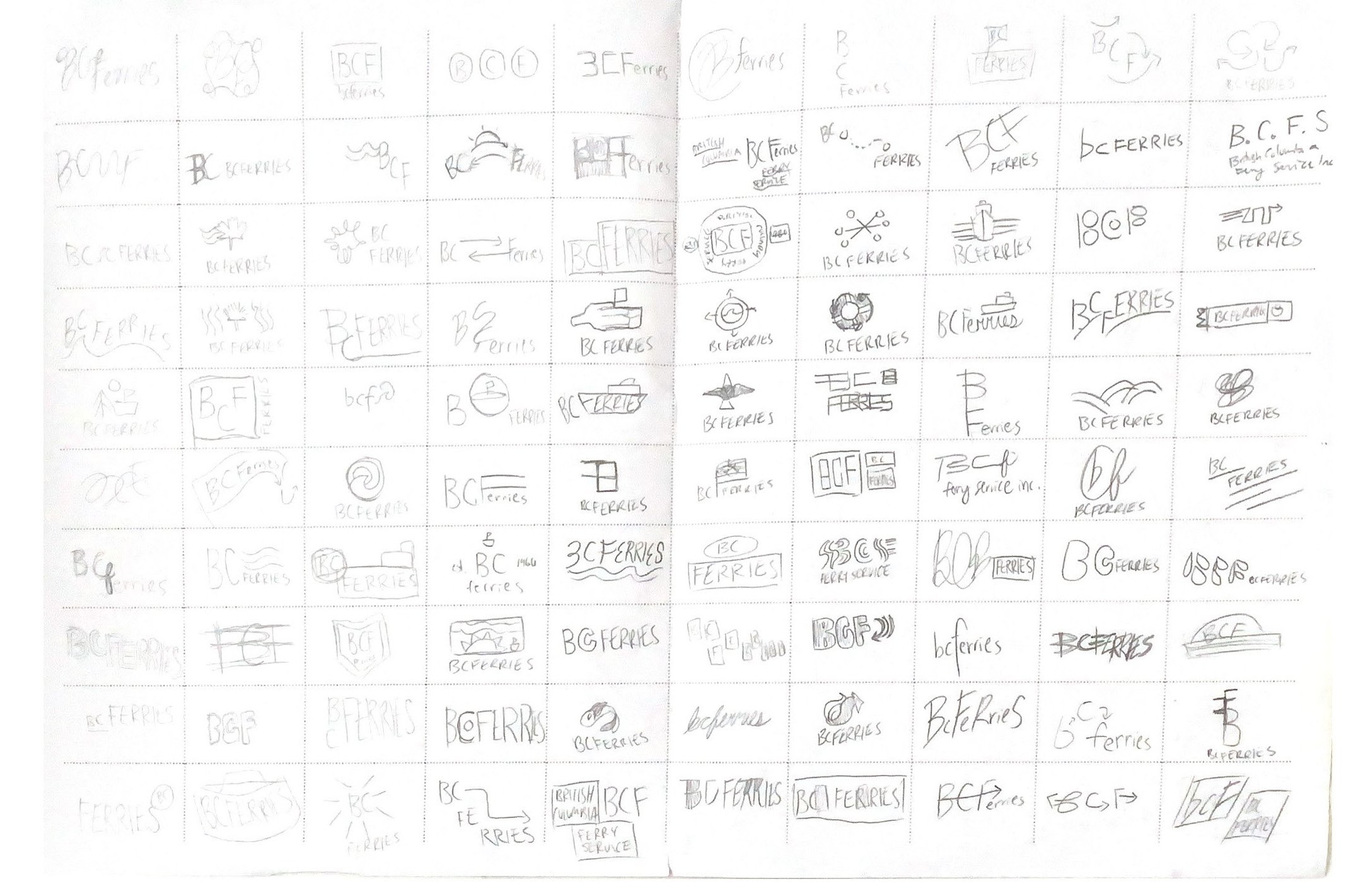


For two weeks, I worked on developing three directions which embodied one or more of the important characteristics of the brand that I’ve discovered through my research:
— Community Centered
— Experienced Focused
— Historically Significant
— Socially Responsible
— Climate & Impact Conscious
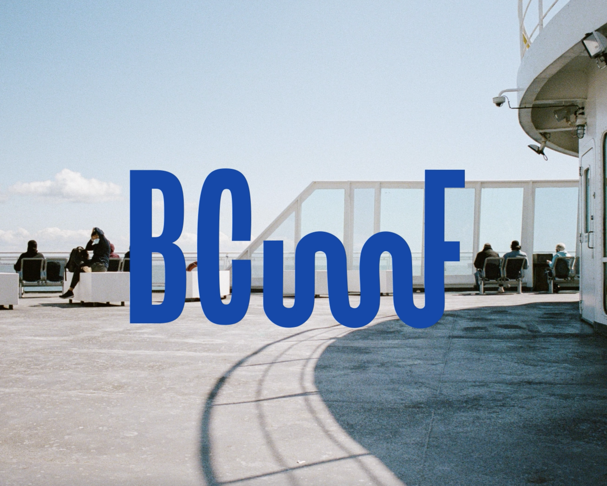
After iteration upon iteration, the final proposed logo conveys the fluid nature of water and the metaphorical "winding highway" that the ferry navigates on a day-to-day basis. Its sleek boldness and abstract nature best conveys the proposed brand repositioning as a vehicle for the West Coast travel route.
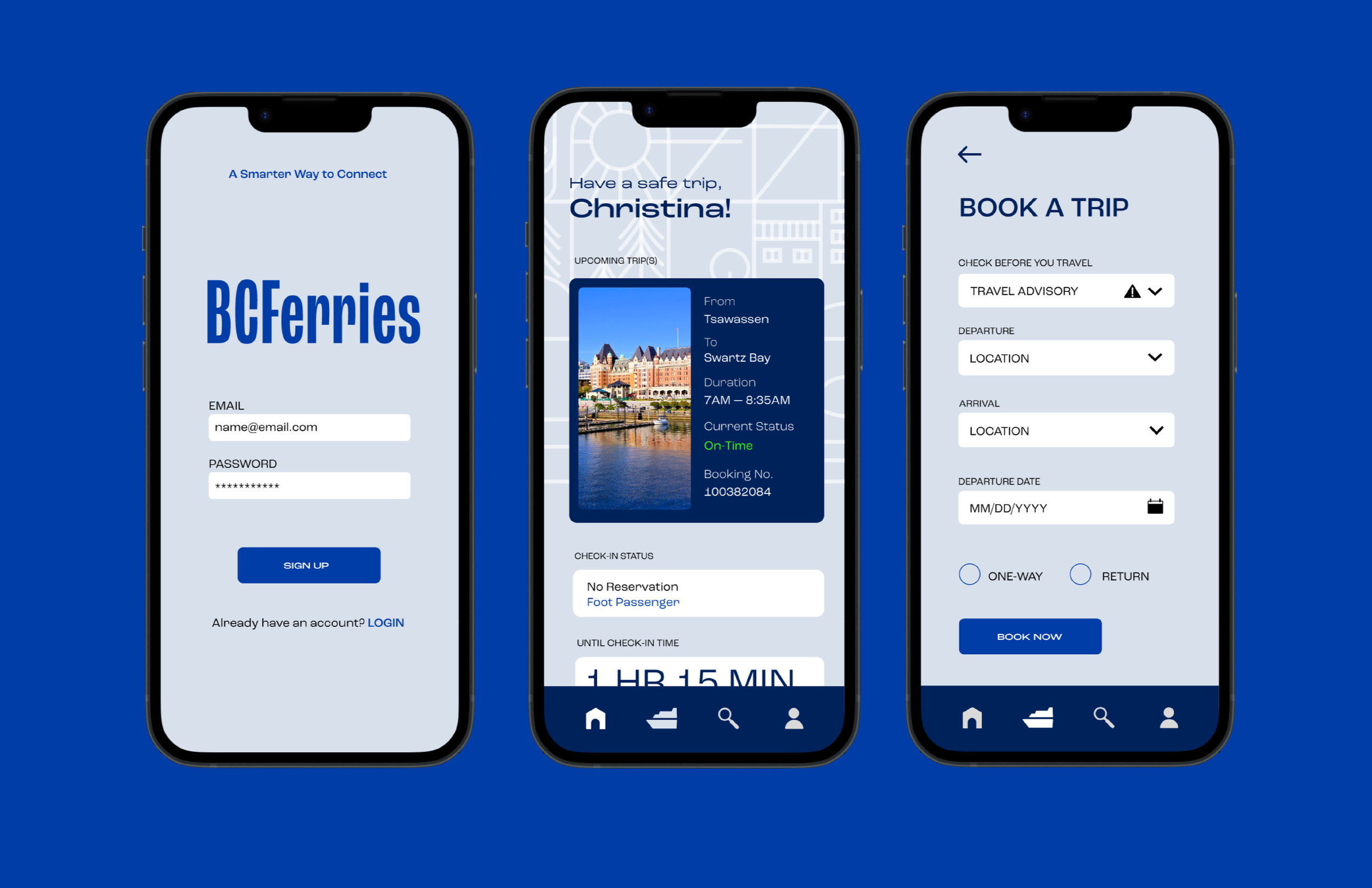
METHOD


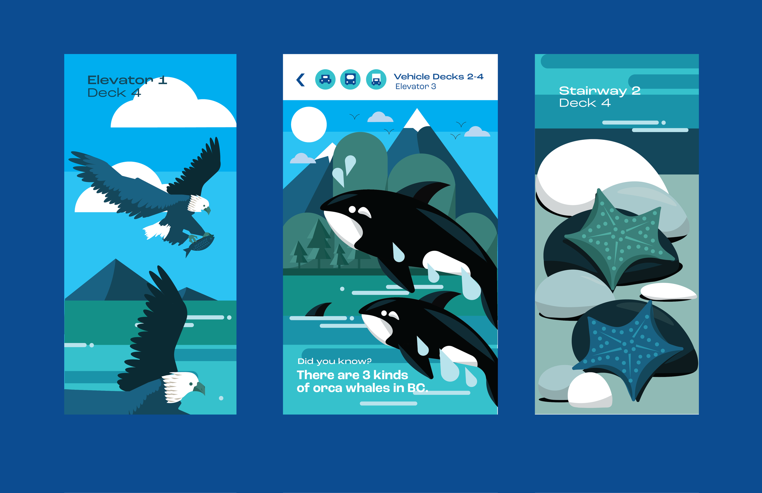
With this project's conceptual rebrand, it felt important to address the different situations which BCFerries exists as a brand. The current logo only uses the initials of BCFerries; its an abstract mark which can be confusing to newcomers and out-of-context situations.
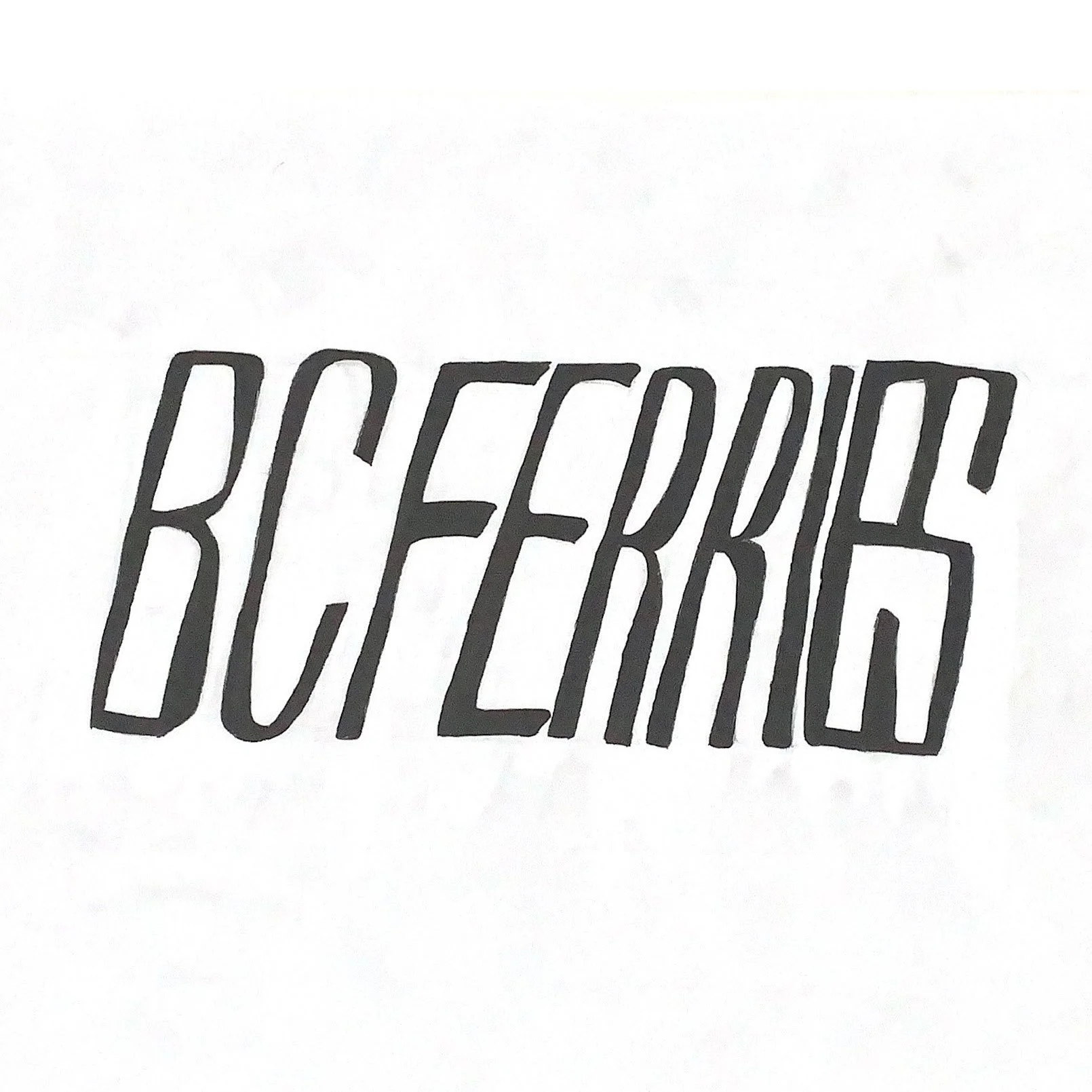
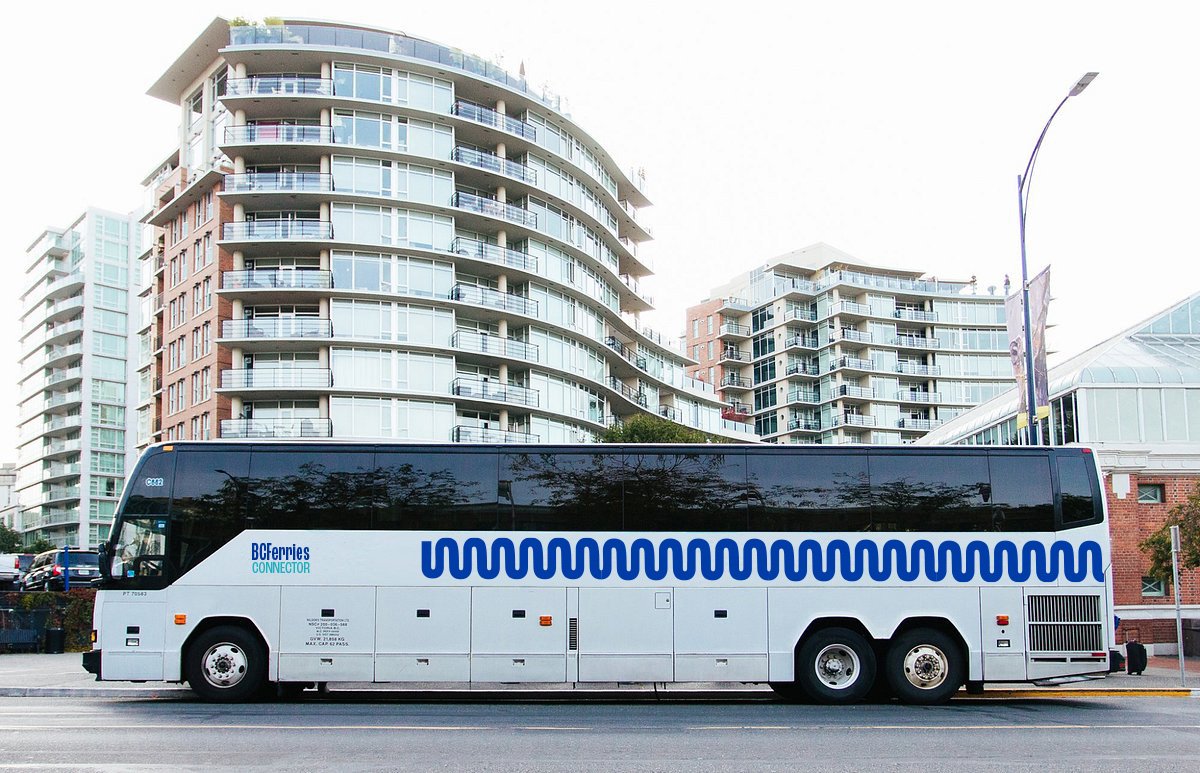
To solve this problem, I developed a secondary logo which serves as a more traditional corporate word mark. The purpose of this secondary logo is to be used for print and marketing. Furthermore, it creates opportunity for BCFerries to build sub-brands that can exist within one cohesive family.
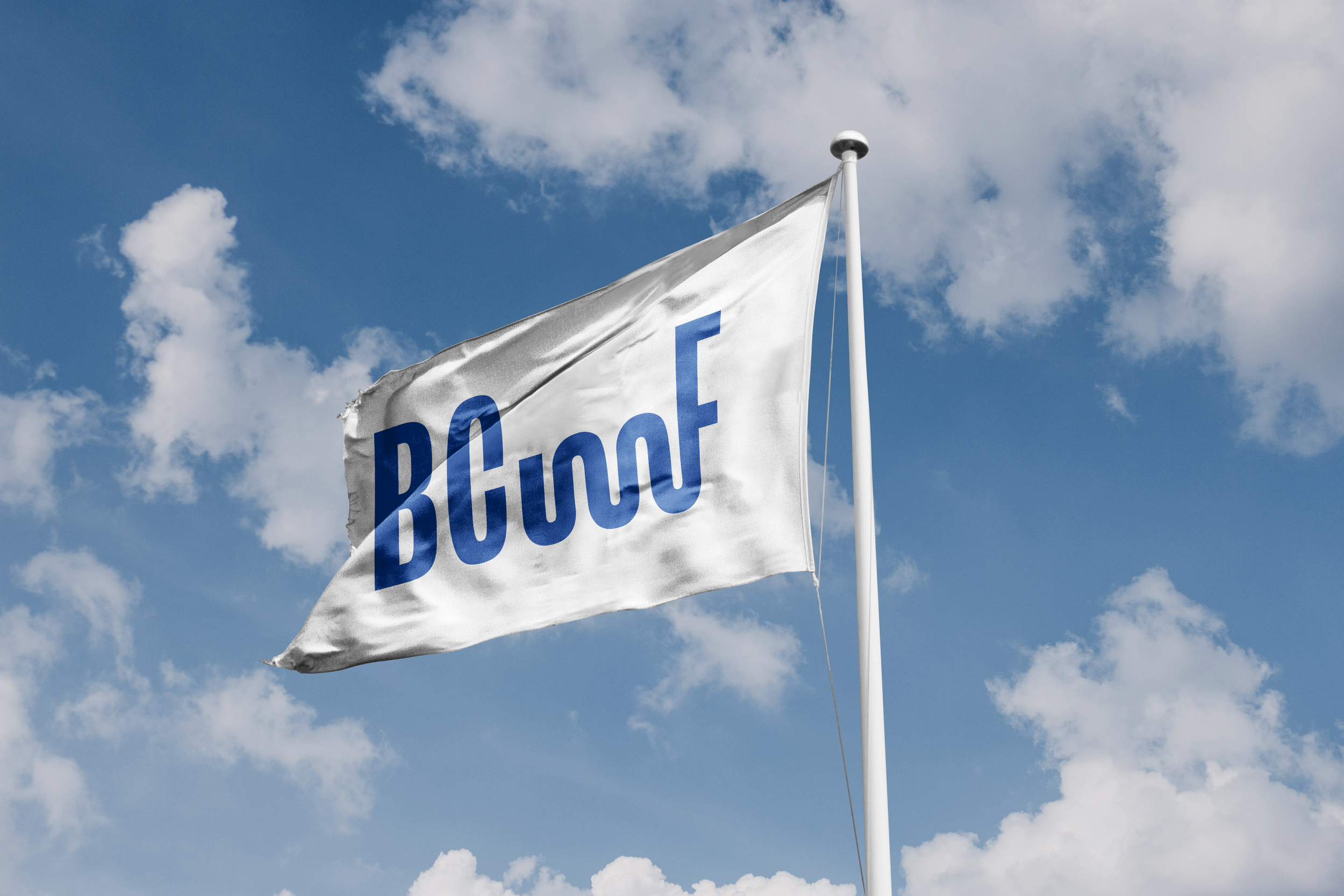
Just like the fluid nature of water and staying true to the idea of "movement", the primary logo has additional variations which lengthen the mark to absurd proportions. Not to be used in corporate or print, these variations bring a sense of joy to the brand which was absent before.
SOLUTION


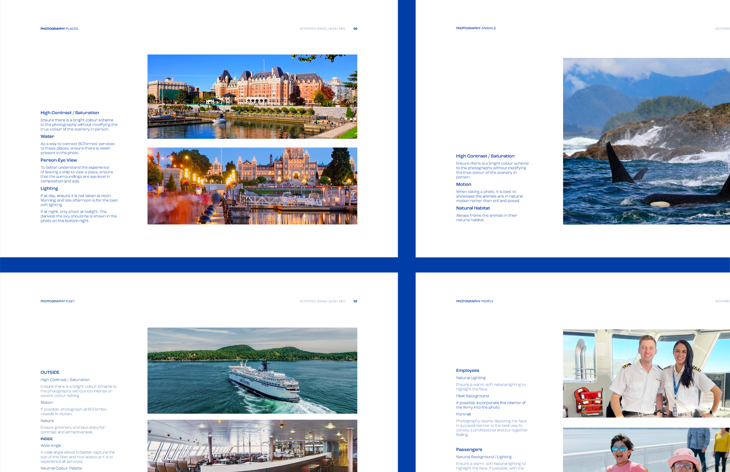
The visual identity must establish an aesthetic which conveyed and balanced two main aspects: the sleekness of a competent public transportation service and the joy of a ferry service dedicated to its journey. Without the sleek minimalism, BCFerries' brand is conveyed as nothing more than a tourist joyride (which can be perceived as tone-deaf to its main audience who live on the West Coast).
However, without the joy, BCFerries loses empathy and credibility as a public ambassador and socially responsible figure.
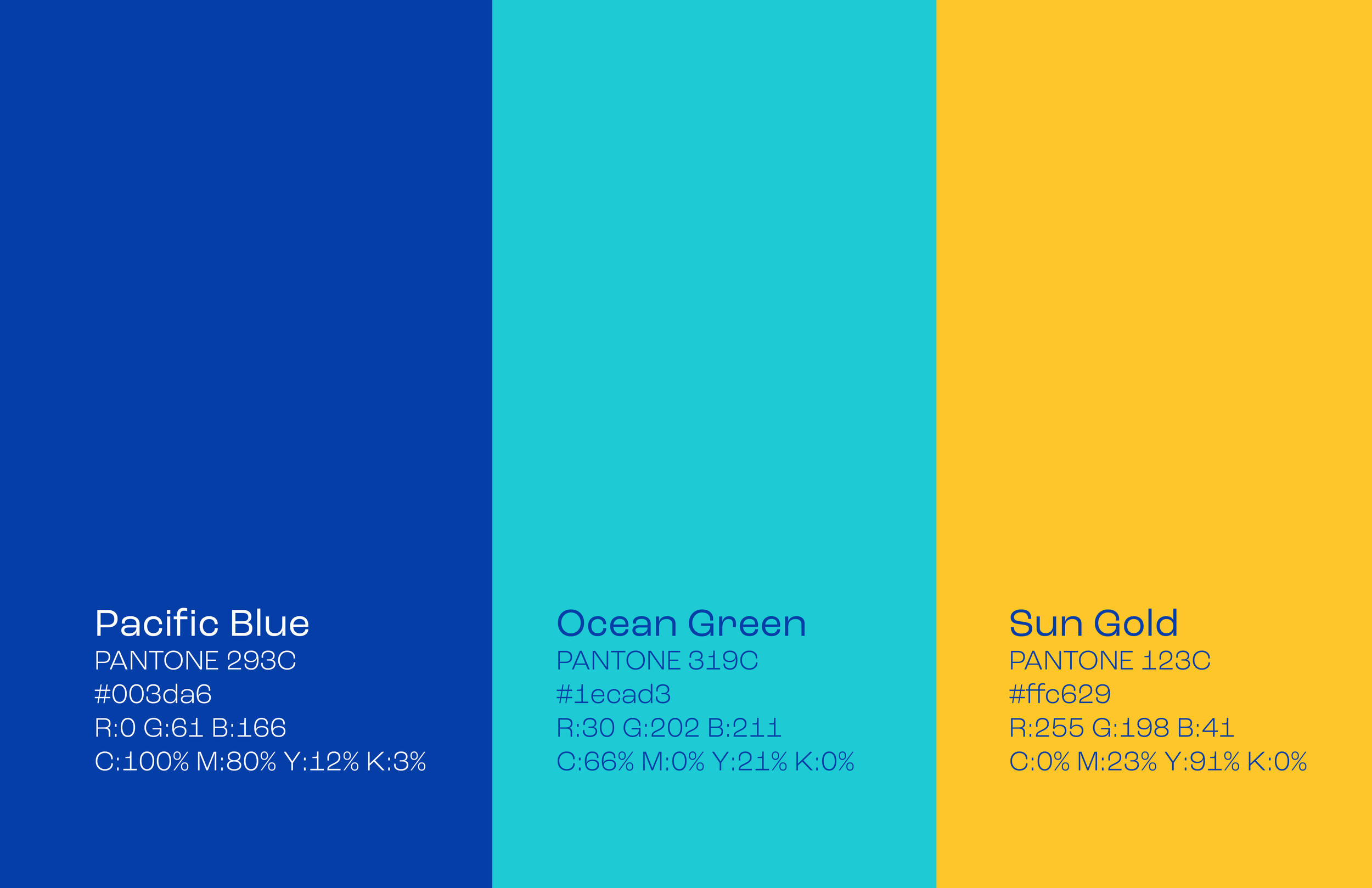
Taking steps to solve this problem led to specific choices for the colour palette and typography. BCFerries' iconic blue is now saturated and richer, as if it’s been painted with fresh coat of paint. A secondary teal is used to add depth and levity to the brand. The yellow is established for the sub-brand, BCFerries Vacations, to help differentiate between advertising and messaging.
The typeface used for the project is the Roc Grotesk family. This is a huge family with 9 weights and 5 widths for a total of 45 fonts. This typeface allows for a sense of flexibility in the brand to prevent BCFerries from becoming stale and predictable.
RATIONALE


Developing the mark was a struggle to say the least. Even after all that iteration, the mark was not perfect. Although I was satisfied with the concept, there were many technical problems with the logo that I had to conquer first while transitioning from traditional to digital.
Unfortunately, the C and F being connected by the stroke in the original sketch did not translate well into the digital space. The C became illegible and it could be read as BOF from afar. The ligature had to go.
The abstract curve proved to serve a different legibility problem. Several people would read it as BCMF or BCIMF. I experimented with colour to solve this problem, but what proved most effective was changing the x-height of the wave. With the all-caps, the lowered x-height of the wave was enough to differentiate it from the letters and be its own abstract form.
Through this project, not only did my technical and ideation skills improve through the rigorous ideation process, but I learned the importance of staying attuned to my objective.
BCFerries, as a fictional client, was an organization with a vast amount of touch-points, consumers, and services, which was overwhelming, at first. However, I discovered that if you remain self-aware of your goals and project context, you can always find a way to refocus and make thoughtful decisions in your design process.
RESULTS